PLUTARCO
CURATED BY
Architecture & Interior Design
MADRID

/05
What led you to found Plutarco and how has the studio evolved since its beginnings in 2015?
Plutarco was born from a passion for design. Ana and I met at the end of our studies, and the connection was so strong that we immediately started designing furniture pieces. We won an INJUVE scholarship, which allowed us to produce our first collection of tables, which we took to Milan. From there, we began working on various interiors, initially with very tight budgets, juggling to create striking effects using color. Slowly, the projects grew in scale, and we started working with hotel groups and residential developments. Now, we are beginning to work on new construction projects.


Your projects are very personalized. How do you ensure each one is unique and reflects both your style and the client's vision?
Great question! Honestly, it comes naturally to us since we are very aligned creatively. It is also true that our inspirations change, but always within a common thread, so I believe there is always a unified vision.

How would you describe Plutarco’s approach to architecture and design?
We always try to look forward, bringing our vision and aiming to avoid repeating the same construction solution twice. We enjoy exploring and proposing new ideas.
How important is color in the experience of a space?
We always say that dark colors embrace you and create an enveloping solution, making you feel more sheltered in the space you are in. A good combination of colors can either relax you or speed up your pace.


Where does your inspiration come from?
Our inspiration comes from all the disciplines that represent our passions. Of course, architecture and interior design are a big source of inspiration, but for us, gastronomy, art, and fashion also play a very important role.
How is the working dynamic between you, Ana and Enrique, the founders of Plutarco? How do you complement each other in the creative process?
We are very aligned, and we really enjoy the ups and downs that the creative process offers. We both propose ideas, and almost always, we agree. What is interesting is that our aesthetic references have always been aligned, so it is much easier to build together.

If you could take only one design piece from any museum in the world, what would it be?
We always say that it would be any painting by David Hockney. In particular, A Bigger Splash inspired us a lot for the color palette of a house we designed.
How do you balance aesthetics with functionality in your projects?
We are always looking for balance, but if we have to “err,” we err on the side of aesthetics. We believe that extreme functionality is overrated because it removes surprises and that unexpected touch, which always gives us the best results.


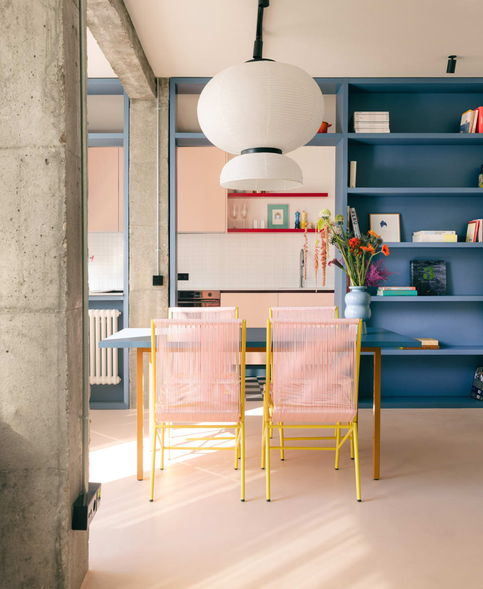
Why did you choose The Masie?
We chose The Masie because it offers a wide variety of products, especially with contemporary lines and a strong commitment to color.
What do The Masie’s furniture pieces inspire you?
The furniture inspires us and brings a lot of light to the spaces where they are located. They act like a color accent that energizes any visitor to the space. Additionally, they inspire simplicity and show how you can achieve an impressive effect with few elements.

Favourite piece of The Masie
The dining chairs, because they are versatile and suitable for both indoors and outdoors.
One colour
Without a doubt, red! It gives us a vibrant energy with which we strongly identify.
Favorite style
Always a contemporary style. We love living in the present.
Country or city
City, always. We are very urban and love enjoying restaurants, museums, galleries, and walking around the city.
References
Our references include Charlotte Perriand, the Bouroullec brothers, and Note Design Studio.